Click here to see the content
My ramblings about "click here to".


We have an ingenious paradigm in user interface design that lets us do away with writing "click here to..." everywhere. It's called a button:
Everyone knows how buttons work on user interfaces. If it looks like a button, that means the "action" in its caption will be performed when it's interacted with. So, this is essentially confusing, unnecessarily verbose, and redundant:
The button styling already tells us that it will perform the action when interacted. But more importantly, "click" isn't a univesal term for UI interaction anymore. We don't click on a touch screen. We "touch" or we "press", but never "click". "Clicking" has never been the only way to interact with a button. We could select a button by focusing on it with keyboard and by pressing space or enter. So, if you prefer to write explicit instructions for your users, you have already failed.
UI is always an abstraction.
Why do we need "click here to..."?
"Click here to..." entered our lives through hyperlinks. Because, many didn't know how to identify a hyperlink and understand that it can be interacted with.
The problem mostly is that interactive links are visually indistinguishable from blue underlined text. They had no distinct features unlike buttons. It wasn't a problem in the early days of web because styling was usually minimal. But, now with every web page with its own design and colors, it becomes harder and harder to learn what is actually a link, and what is not.
Heck, the same thing happens to buttons. After the whole flat design craze, what's a button anymore? Text with slightly off-colored background?
That's probably why AmigaOS in the early 90's used button-like design for inline hyperlinks.
See how easy it is to distinguish stylized text from hyperlinks? It doesn't even affect the text flow.
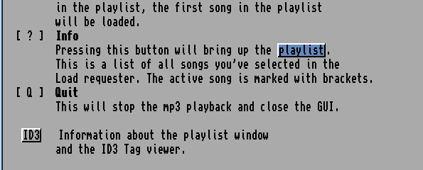
I had liked AmigaGuide's approach so much that I had incorporated it in my own hypertext help system I wrote for our DOS GUI back in the 90's.
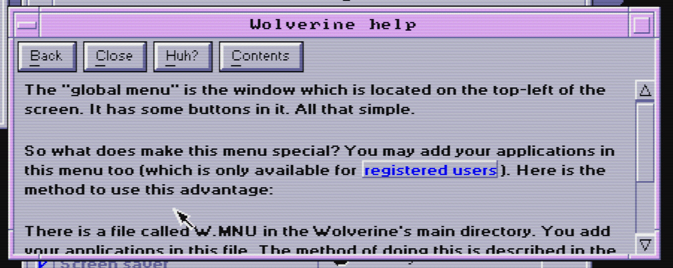
See, I didn't have to write "click here to read more about registered users" because it was obvious what it was and what it did when clicked.
But, AmigaGuide wasn't a web browser, neither was my help system, and web browsers probably needed to work with fewer colors and many different fonts, possibly with less intrusion. For instance, if you had too many links on a web page, the slab design could make reading hard. Underlines were subtler, and for a time, they were perfectly okay too. Hyperlinks were only blue because some guy liked the color though.
But even underlines were a little bit distracting. Web developers started opting for hyperlinks with distinct colors instead of underlines. They were impossible to discern from other colored text, but once you got the hang of it, you'd learned that what was hyperlink and what wasn't on that specific website.
Because of that people had to emphasize that something was clickable with text: "Click here to..."
The confusing semantics
"Click" isn't an accurate term, but neither is "here". "Here" describes a larger area than the text "here" and less than what the user might consider where "there" is. The UI container could pass as "there" too. So, it usually means "click on the underlined part", if you're lucky.
I find that kind of meta messaging confusing. First, it implies that the user wouldn't know where to click unless specifically instructed. Second, "here" implies a spatial link between the sentence and its coordinates, but there's no such thing. What if someone is using a screen reader? It doesn't make any sense, like how it doesn't make any sense to use other spatial adjectives like "above" or "below" in UI. Don't use those. Let users use their eyes and brains to follow familiar UI layouts.
Sometimes, your UI text doesn't even show up at the places you expect. That's why you usually avoid explicit instructions because they might confuse more than they help. Like how this iPhone notification gives me explicit instructions which don't work at all on my Garmin watch:
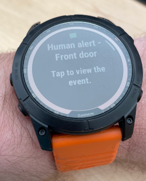
Why do you even explain something that's universally applicable to all notifications? Everyone knows tapping the notification navigates to the context of that notification. It doesn't need an explanation. Otherwise it would be like every app having "bug fixes and improvements" in their release notes. And... unforunately, we have that... But, anyway, don't do this. Stop being unnecessarily explicit.
People might have been used to these explicit but confusing instructions. But, that means they've learned their way around the confusion. That means people still had to learn to deal with it. You didn't help people, you just changed what kind of friction they had to deal with. People would have found their way even if you hadn't done anything anyway.
You've just added cognitive overhead of semantically confusing redundancy for everyone.
Let UI do its work
UI is always an abstraction. You can never be explicit enough for everyone. My recommendation is to let users deal with common paradigms, explore, learn, and become effective instead of throwing training wheels under their feet at every opportunity.
- Use a button that preferably looks like a button with a caption instead of a underlined text with "click/tap/press here to...." whenever there's something clickable that leads to an action or a separate UI page.
- Avoid spatial references in UI text. You don't know where that UI text will be.

- If a button isn't available in the context or not suitable, use blue underlined text for hyperlinks as that's now pretty much universal. Don't add "click here to..." before every link.
- Optimize for people using your app every day, instead of people who's never used a UI before. You're underestimating people's capability to learn.
- Make exploring your UI inviting. I think Google's "Undo" paradigm is perfect for that.
Make it simple, make it powerful, and trust your users.