The Tablet That Has Never Been: Surface Pro 6
My personal experiences with Surface Pro 6

I have been following the Surface lineup and salivating at the design of the products since the launch of the first Surface tablet. It is a beautiful looking piece of hardware and promises a lot. I finally purchased one, the Core i7 model, last week and I returned it today. I wanted to write about my impression and my thoughts about the device, which I hope would help the team developing it at Microsoft and people who are considering buying it.
Pleasant Packaging
Make no mistake, I don’t care much about the packaging, but I must admit that great packaging can also be very assuring for a consumer. The packaging of Surface Pro 6 feels quite Apple-ish, like the useless but elegant vacuumed box design where you have to patiently wait for the box to fall on your lap with the help of gravity. Not for the impatient but I still liked the packaging. You feel like you bought an expensive piece of hardware, with a decent amount of instructions booklets included.
Sexy Hardware Design
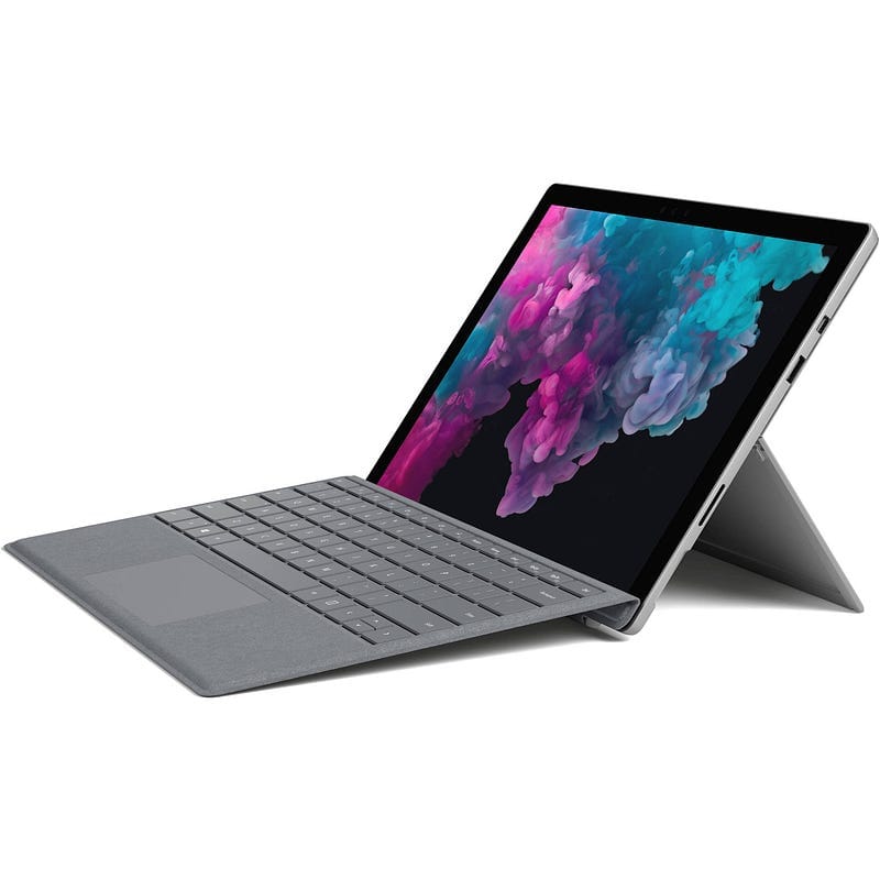
Surface Pro 6 handles and looks great. It becomes quite cumbersome with the type cover on but without that, it feels solid, balanced and lightweight. It feels like you can’t damage it easily and it would recover from falls at a short distance without any scratch. I like the bezel, the kickstand and the location of buttons.
The screen is magnificent: vivid colors, great resolution, great aspect ratio. The charger is magsafe. Almost everything’s great about the hardware.
But…
Unfortunately, the great experience starts to fall apart after you turn it on. Here are the troubles:
Setup Experience Lacks Elegance
The OOBE (Out-of-box Experience) flow is unnecessarily long and troublesome. First, the whole screen looks too crowded with too many icons about accessibility:
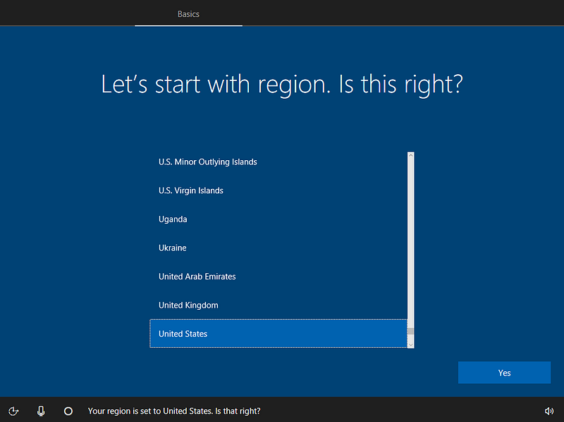
First of all, Cortana during the setup doesn’t feel good at all. It’s confusing, demanding, and unusable. It only listens to your voice at certain moments where you have to time your answers carefully. It can get you wrong easily if you’re not a native speaker like me. It repeats instructions on the screen unnecessarily. It basically makes me follow two things at once: the text on the screen and Cortana’s voice. Otherwise, I feel like I could miss something important. So that’s an anxiety generator at the start and just a nuisance later.
What should happen is a question like “Would you like to use Cortana during the setup?” along with other Accessibility options at the beginning and never show them later in the setup flow. You don’t suddenly start needing accessibility options anyway, you either do or don’t.
Removing icons would increase usability significantly since I have to discover what each icon does and figure out if I need to click on one of those icons before doing anything. Actually, the “Microphone” icon should never be there even with Cortana-based setup; Cortana should always be listening (only during the setup obviously) like the most basic customer support hotlines.
When implementing Cortana into the setup, Microsoft probably bet on the Sci-Fi feeling of conversing with an assistant to setup your device but the friction it causes diminishes that value completely. Voice assistants are not novel anymore anyway, every phone sold comes with them. I’d actually remove Cortana from setup completely.
So the “expensive feeling” actually starts to crumble during the setup phase. You feel like you’re setting up a PC, not a high-end brand device.
Ambient Light Sensor Is Buggy
The Ambient light sensor on Surface Pro 6 actually detects its own screen light as ambient light and enters a feedback loop to a certain point. That makes the brightness always fluctuate in a dark room based on what kind of screen you open on the app. Something you’d never expect from an upscale tablet like this.
Not A Fan of The Fan
The Core i7 version comes with a fan (I didn’t know that) and runs the shit out of it. I never thought I’d dislike a fan on a tablet but apparently, it completely kills the mood of having a technological slab in your hands. It suddenly feels like a laptop without a keyboard. It is relatively quiet but it still feels cheap. And despite all the efforts of the fan, the device can get very hot. I mean, you-cannot-hold-it hot.

Windows Falls Short Of Being A Tablet OS
There are a tremendous amount of issues with Windows on a tablet and I am actually appalled. Because I love Windows 10, I’m part of its history as a former Windows engineer, and I thought it would work great on a tablet. Apparently, that’s not the case.
Most of the problems with the operating system stem from the ambitious goal of being two things at once: a desktop OS and a tablet OS. That makes the overall experience confusing, inconsistent and unpleasant. Make no mistake, I’m not an end-user at all. But, my single expectation from a tablet is a smooth and consistent experience. I shouldn’t think about how to perform a task, yet the remnants of the desktop experience forced me to do so.
- When “Automatically hide taskbar” is enabled, it shows up randomly sometimes and it doesn’t go away. Touching the app doesn’t make it go away. That actually obscures the app’s menu items on the bottom of the screen and it’s impossible to fix. I must emphasize that this is after ALL updates are applied and the sixth generation of the product lineup. I should never have any problem like that.
- I had a similar problem with obscured UI by the window title bars which appear when you touch at the top of the app. That makes it extremely hard to use app’s UI if they are very close at the top. I don’t know if Microsoft guidelines state “stay away from the top of the screen” but most of the apps I used had UX at the top (Skecthable, Adobe Sketchbook, Baconit, etc).
- There is no simple way to go to start menu if you have “automatically hide taskbar” enabled. You have to either kill the app on tablet mode by swiping carefully from top to bottom or swipe up from the bottom of the screen to expose the taskbar and click on the start icon on the bottom left. It feels like Microsoft expects you never enable this option, but it comes enabled by default.
- “Back” navigation on tablet mode taskbar behaves like Android and has the same UX problem: It exits the app when the app doesn’t handle the back operation or doesn’t have anything to go back to. That is a serious problem because:
- Switching between apps is cumbersome. You swipe from the left edge of the screen and a “task view” shows up from the bottom (why not from the left?) and you select the app there. It doesn’t feel snappy enough, but more importantly, it shows “too much”. The “Task View” shows not just your current activities but past ones too, a feature of Cortana, which makes only the top left corner of the screen relevant and the rest, mostly useless if not frustrating.
- You see the remnants of the PC culture on the UI, like “Realtek Audio” tooltip on the volume control of your Surface device. “What’s a Realtek Audio?” a regular user would ask. It should simply say “Internal Speakers” for a Surface device, at least only when setting the volume. User doesn’t need to be exposed to the relationship between device drivers and OEM manufacturers. They don’t really care.
- There is no “slider-based” brightness setting on the action center. So to make the screen darker in a dark room you have to first touch “Brighter” there, get blind temporarily and then “Darker”. It’s quite ridiculous.
- There are branding issues in general. For instance, when I tried to “reset” the Surface to factory defaults it says “Reset this PC”, not “Reset this Surface Pro”. I think Surface brand needs to distance itself from the pool of generic PCs.
- Resetting to the factory settings takes too long because of the architectural limitations of Windows (the OS/apps and the data are mixed up together). Apple’s iOS handles this scenario smoothly, it wipes out everything in seconds. I started wiping out my Surface when I started writing this article and it finished just now. Obviously this isn’t really important, I mean, Android does that too and it gets away with it. But still, something that fell short of my expectations.
- The File Save Dialog UI of the apps are the desktop dialog which is very confusing on a tablet. You have all those small, intricate UI elements designed for the desktop.
A counter-example would be the Windows on Xbox One. It’s adapted to the console device perfectly. It’s smooth, seamless and it works great. Somebody needs to do exactly the same for tablets.
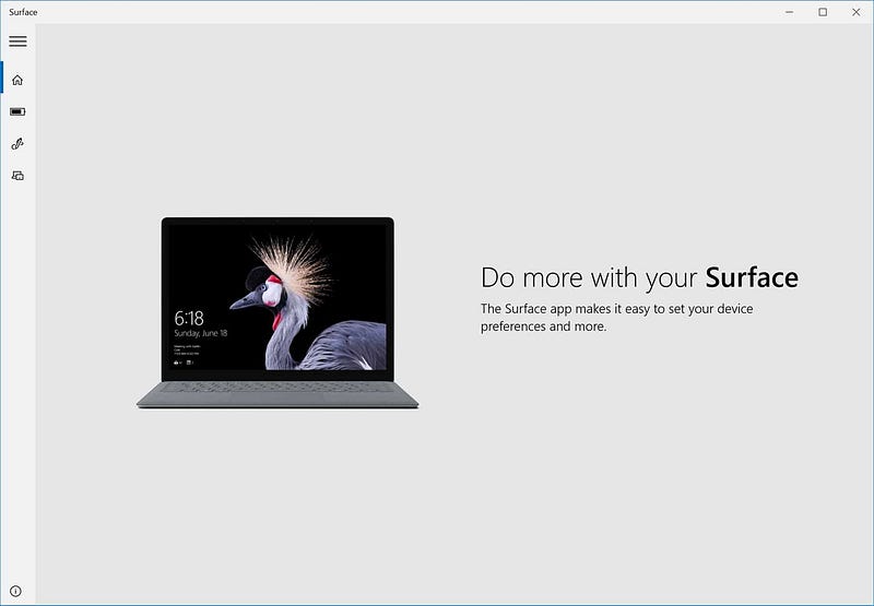
Surface App Is Underwhelming
The “Surface” app that comes with the device makes you expect an exploration tour around the features of your Surface device, like how you can actually switch tasks without Googling them, and some diagnostics features perhaps but it’s merely a pen configuration setting and some battery level indicators, nothing else. It’s extra disappointing because it’s displayed very prominently on the start menu too.
Surface Pen Runs On Batteries
I thought Surface Pen didn’t require a battery, I don’t know where I got that information but I learned that it actually ran on a single AAAA battery after opening the package. I had dissed Apple Pencil about how it required the user to charge it by inserting it into the lightning port, but I think it is actually worse to have replaceable batteries. Arguably, you can use rechargeable batteries, but that requires some extensive set up solely dedicated to those batteries.
Type Cover
Type cover is simply amazing, there is no question about it. It even provides a touchpad which is a natural instinct to reach for it when using a keyboard. The keyboard doesn’t feel as good as a laptop keyboard but it’s very close. It snaps easily into Surface and detaches easily too. I’m impartial about the fabric texture, had no issues with it but it felt like it might be harder to clean up in the long run.
Security
All data on your device is encrypted by default. I didn’t have a chance to test the face scanner with a photograph so I’m not sure how it fares but it works well.
Final Verdict
Surface Pro 6 is a great piece of hardware but lacks a cohesive tablet experience unlike iPad, or Android tablets for that matter. That in fact, might appeal to some as it can count as a lightweight laptop, but I believe the tablet form factor is an entirely different beast and Microsoft already provides two different series of laptops in the Surface lineup (Surface Laptop and SurfaceBook). I believe Microsoft needs to focus on the tablet experience on software and create a better, coherent experience for the users. That can easily make it an iPad-killer.